

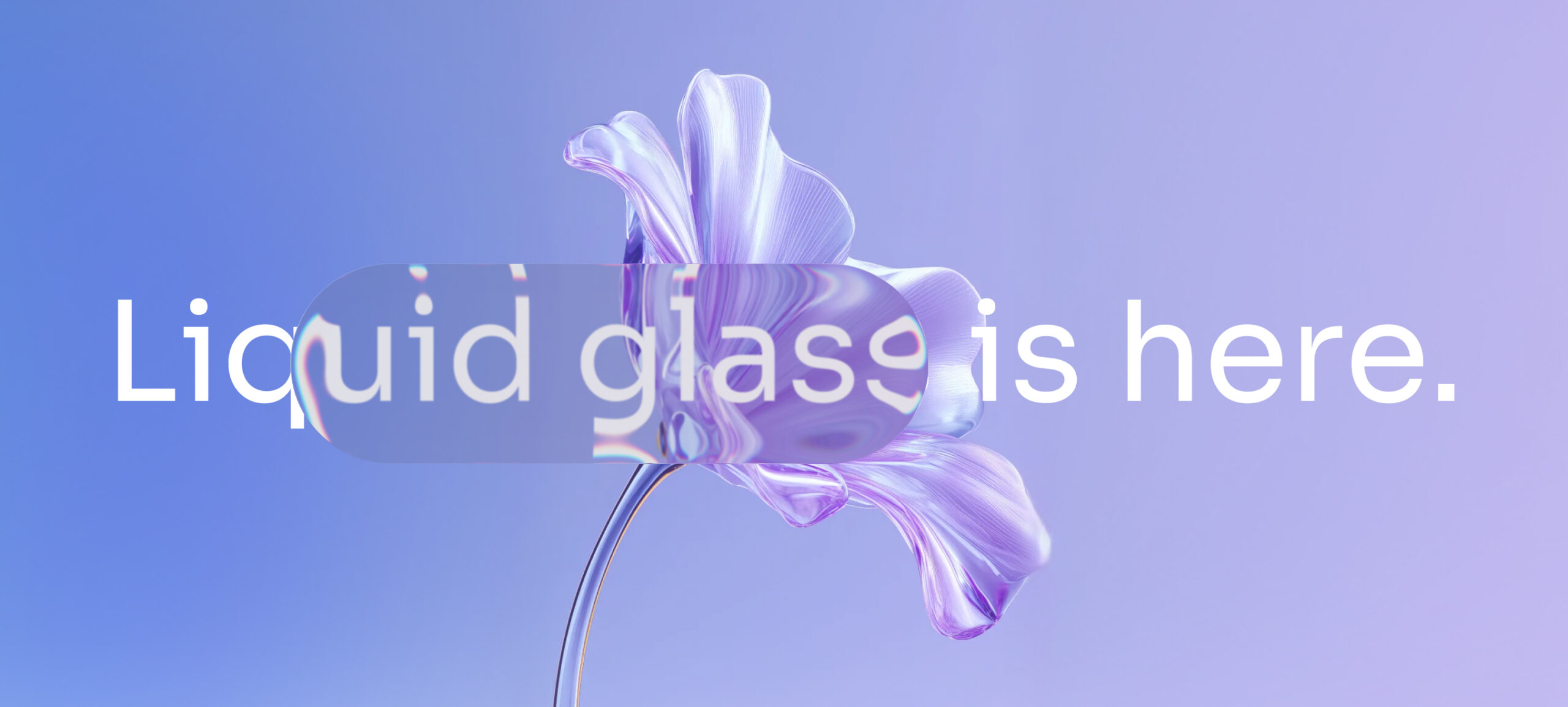
Put your app next to Apple’s own apps on the latest iOS. If yours suddenly looks heavy and flat, you are seeing what Liquid Glass changes.
For more than a decade, interface design moved in cycles. Skeuomorphism copied textures and shadows from the physical world, then flat design stripped them away. Liquid Glass goes further than a new visual style, because it changes how an interface is built and how it behaves.
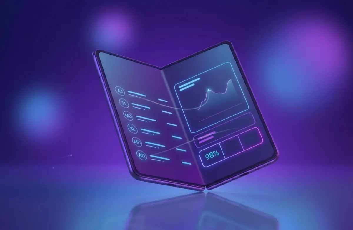
Apple now treats the interface as a material. UI elements behave like translucent layers of glass: they refract light, blur what sits behind them and react to movement. Depth used to come from simple shadows. Now it comes from light, parallax and motion. So designers have to decide how each surface behaves, for example how much it blurs and how it moves when you touch it.
What actually changes in the interface
You could see this coming across recent versions of iOS, and Apple Vision Pro shows its most advanced form. The logic is the same everywhere: the interface should feel part of the space around it, not stacked on top of the content. Panels float, navigation flows and screens change shape instead of switching abruptly.
In practice, three things change for product teams.
- Hierarchy comes from how materials behave. Position and color contrast matter less. Translucency signals depth, blur signals distance and motion shows what caused what.
- Transitions do real work. They help users understand what just happened. Users don’t jump between disconnected screens anymore, because each change is visible as it happens.
- Mobile gets ready for spatial computing. Apple uses the same principles on the phone as in immersive environments, so 2D and 3D experiences start to feel like one system.
Where mature apps will feel the gap
If you run a mature mobile app, this matters more than it seems. Liquid Glass exposes what we call experience debt. Apps built on rigid cards, heavy blocks of saturated color and static modals can suddenly look dated next to native components. You notice it most in navigation bars, sheets and backgrounds that don’t match the system’s material logic.
Adding a blur effect won’t fix it. The design system needs work at its core, starting with rules for translucency, layering and motion in the component library. The tech stack also has to handle GPU-heavy rendering without slowing the app down. Legacy frameworks and heavily customized rendering engines may struggle here, which creates tension between brand design and platform consistency. That’s why Liquid Glass pushes teams to update both their design thinking and their technical setup.
When every app looks like glass
There is a branding risk too. As the system’s own look becomes more expressive, apps start to look alike. If every app uses the same translucency and depth rules, color and typography alone won’t set yours apart. We think the difference will come from interaction design, a recognizable motion style, personalization and the intelligent features you build in. As more products use AI, a fluid interface becomes the place where the product adapts to each user.
Where Liquid Glass can go wrong
Translucency and motion can make an interface clearer, but too much of them creates visual noise. Accessibility suffers when contrast drops or when layered backgrounds make text harder to read. Glass can hide as much as it shows. Without strict design discipline, you get overstimulation instead of elegance.
The bigger risk is choosing spectacle over substance. Visual trends have often pulled attention away from product basics. If a team adopts Liquid Glass only because it’s new, it may spend heavily on polish while usability and performance fall behind. The value is in the idea behind it: an interface feels alive when it responds to context and to the user.
Four questions for your product team
Before you redesign anything, it’s worth asking:
- Can your design system handle dynamic materials like translucency, layering and motion?
- Is your technical architecture ready for heavier rendering and motion logic?
- How will your brand stand out when the operating system defines most of the visual language?
- How can a fluid interface support your AI and personalized features, instead of just decorating them?
Liquid Glass is a turning point for mobile apps. Teams that treat it as a cosmetic update will take on hidden complexity for little return. Teams that treat it as a change in how interfaces work can use it to build apps that feel modern and genuinely responsive.